
For and Against Interpretation
When is wall text a bridge between the viewer and the artwork it accompanies, and when is it an obstacle?
Recently, I walked into a gallery and came toe to toe with a square patch of dirt, sticks, and dead leaves. The nodding heads of desiccated cow parsnip and burdock, studded with burrs, swooned at my knees. This square of no-man’s-land was accompanied by the following explanatory text:
I would love to preserve a site important for gay and queer culture which is a cruising ground located close to where I live, near a bike trail and separated by a railway where there are hundreds of men cruising there every day. Cruising for sex is moving around a specific public site in search of a sexual partner, usually anonymous, casual and one-night stand.
Written not by the show’s curator, but by the artist (Antoine Vogler), the text expressed a wistful hope about the power of art: “I wish this installation, put in the context of the artworld, will help record and transmit this site and the knowledge and practices attached to it.”
In her recent book Get the Picture: A Mind-Bending Journey Among the Inspired Artists and Obsessive Art Fiends Who Taught Me How to See, the journalist Bianca Bosker narrates her quest to understand and appreciate contemporary art. The more she learned about how to look at art, the more she came to hate wall text. “The wall text hovers just to the side of art,” she writes, “like the answer key at the bottom of a word search, its definitive tone sending the message that there’s only one right answer to the art.” (To be fair, the text for Vogler’s piece was on a sheet of paper I picked up from a small plinth, not actually affixed to the wall.)
Personally, I see wall text as an art form of its own, existing in an ekphrastic relationship with the artwork on display. There is wall text I love, and there are galleries I avoid because the text ruins the art for me. When is text a bridge between the viewer and the artwork, and when is it an obstacle?
*
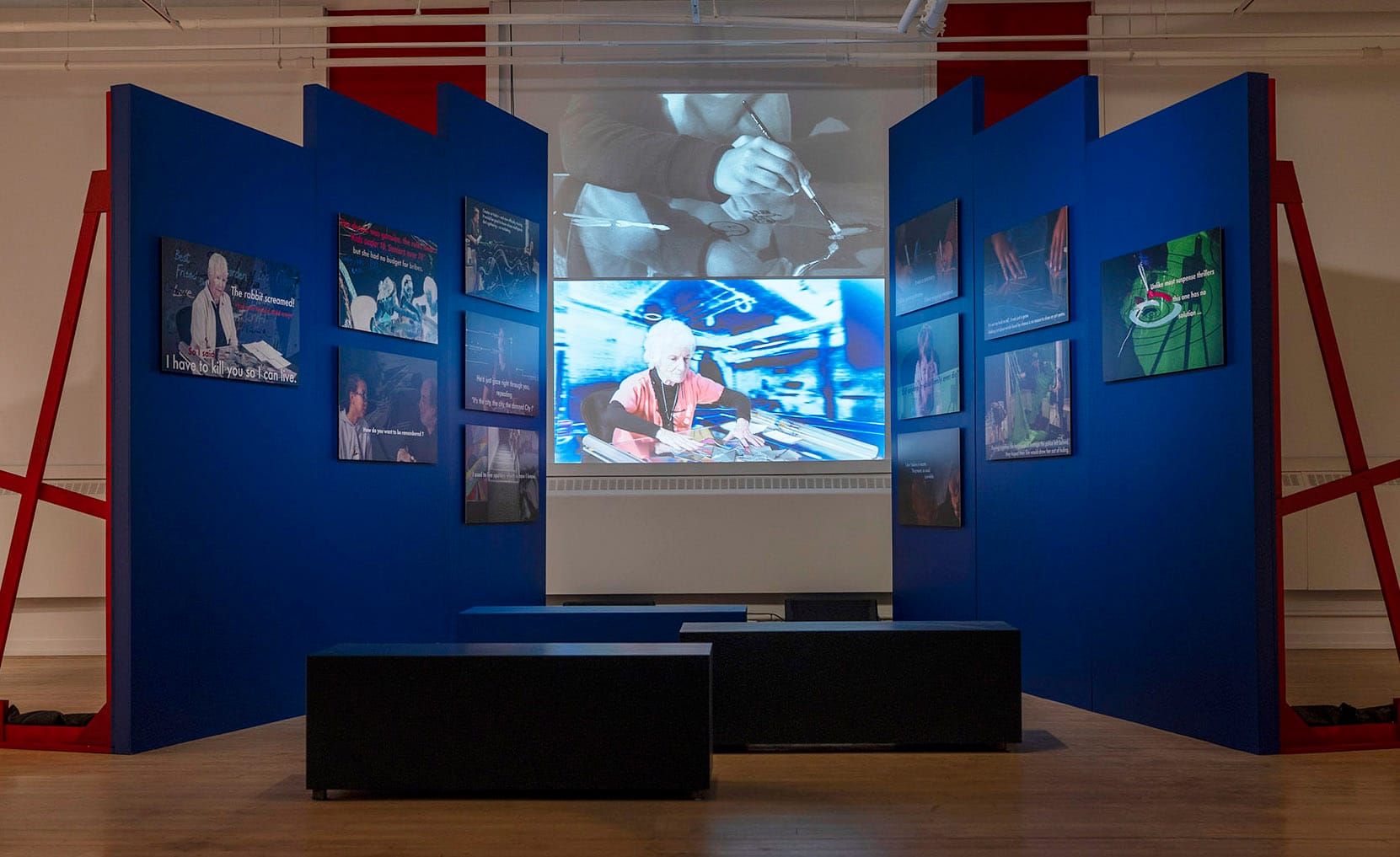
Since 2009, the American Alliance of Museums has held an annual Excellence in Exhibition Label Writing Competition. One juror, Swarupa Anila, made the following bold claim for what wall text can do: “A brilliant label sweeps you into a bodily experience. Eyes widen. Breath stops. Skin rises to goose bumps. Heartbeat quickens. You look around and feel you’re seeing a world that never existed before that moment.”
One of the key questions Bosker explores is this: how much of an artwork is visible to the untrained eye? If context is key in making sense of art, then approaching a painting with no knowledge of the artist’s biography, how the piece fits into the history of art, or of the allusive undercurrents at work may mean missing the point of the piece altogether. If, however, art is primarily something experienced with the senses—an immersion in shapes and colours and the feelings they provoke—then “explanation” may be not only unnecessary but obstructive.
In her famous 1964 essay “Against Interpretation,” Susan Sontag writes: “The fact is, all Western consciousness of and reflection upon art have remained within the confines staked out by the Greek theory of art as mimesis or representation.” Art, we imagine, is not itself real, but must always be referring to some more real or true thing hiding behind the surface of what we see. This is why we are engaged in an endless and fruitless project of interpretation—of trying to divine what is “really” going on in an artwork.
Who do we look to for this explanation? Some critics have complained that galleries make this project of interpretation too hierarchical, suggesting that art is the province of experts. In response, some galleries and museums have commissioned non-expert community members to write text to accompany exhibitions. One winning entry to the AAM’s competition came from an exhibition at the Delaware Art Museum in Wilmington. As Anna Faherty writes in a recent article for the British magazine Museum Next, it’s not immediately clear what the artwork, a black-and-white photograph fourteen by eleven inches, is picturing. “At my first glance, I saw what looked like a sink in the corner of an empty room.” However, as Faherty examined the accompanying text, she realized “the exhibition label for the image is a masterclass in how to reveal, reframe and provoke.”
The work, by American photographer Danny Lyons, is titled, “Segregated drinking fountains in the county courthouse in Albany, Georgia, 1962.” The text that accompanied the photograph had been commissioned from Melva Ware, a local Black author. She recounts an ordinary Saturday afternoon with her grandmother, Mame, “the strongest, smartest, most beautiful woman in my six-year-old world.” The two of them were sharing hot dogs and roasted peanuts at a municipal fair in Atlanta, and the child Melva ran up to a fountain to have a drink of water. “Mame tackled me as I reached the top step and lifted me to a tiny bowl where she turned on the water spigot, and in a quivering voice announced that ‘this one is for us.’ Her voice frightened me—it was barely audible, awakening something for which I had no name.”
It’s a deeply moving story that indisputably tells us much about the artwork, especially for non-Black viewers. However, Bosker (and Sontag) may still have a point. When Faherty first looks at the photograph, she sees a sink. After reading the work’s title, she looks again. This time, “I realise that my perceived sink is in fact a water fountain. I realise there are even two water fountains in the scene, one far smaller and less accessible than the other...my eyes are now drawn to the signs placed above each fountain; one says ‘WHITE’, the other ‘COLORED’.” After she has read the entire text, she remarks: “Like any good story, this one helps us imagine ourselves right there. It even gets our senses buzzing. We hear the hustle and bustle of the market, smell the hot dog and warm peanuts and feel the comfort of being close to someone we trust.”
This is why I perceive wall text as ekphrastic—artwork composed in response to another artwork. Arguably, we are now far from the photograph itself, and from the project of deep looking. We are instead responding to the short story that has been recounted to accompany the photo, and which lends us a richness of detail that slakes our thirst for both content and context, but perhaps gives us less of a starting point for engaging with the photo’s form. Sontag writes, “By reducing the work of art to its content and then interpreting that, one tames the work of art. Interpretation makes art manageable, conformable.” It is perhaps easier for us to know how to respond to the photograph when it is positioned for us as being “about” a painful episode in the history of our culture.
Left alone with a work of art, simply looking, we might feel adrift or uncertain. But is it so bad to be uncertain? We’re used to scanning for information, and the discomfort of not knowing what to think—or even what we’re looking at—forces us to slow down. When our uncertainty is resolved too quickly, an exhibit runs the risk of having the explanations linger with us while the artworks themselves slip from our memories.
*
Reading and looking, however, don’t have to be mutually exclusive. On my first lap of the small Pierre-François Ouellette gallery where I saw Antoine Vogler’s “Cruising Ground,” I spent more time reading the text than looking at the art. (Technically, the sheaf of paper on the plinth offered a series of artist’s statements rather than curatorial text, but these statements perform much the same function: they offer visitors an explanation of the artwork.) It was a group show, and in addition to the patch of dirt, there was a piece involving a desk-fan aimed at a series of billowing blue-and-white silk rectangles to represent the sea; a set of smooth wooden shapes we were invited to touch; a goopy-looking homage to a set of golf clubs; and a looping string of paper beads suspended from the ceiling. I was struck by a line in the artist statement for this last piece, created by April Steffeck-Vogel: “Recently, it has been difficult for me to find artistic ideas that have an underlying meaning or message, something that is almost expected from artists.” The string of paper beads was a defiant response to this expectation. Its message, Steffeck-Vogel wrote, was that she liked making paper beads.
Remembering Sontag’s advice to experience “the luminousness of the thing in itself, of things being what they are,” I slowed down. I went back to “Cruising Ground” and looked more deeply. I saw that the patch of ground was not precisely square after all—dirt spilled from its edges, blurring the transition between the art and the ordinary gallery floor. Inside the squarish space the dirt created, I noticed other patterns: the wounded roundness of broken leaves, the vulnerable sweep of crooked twigs. The glint of a condom wrapper, the parted lips of a flattened plastic bottle. Ocean sounds washed over from the neighbouring installation.
I wondered what other kinds of text could be written to accompany this patch of dirt, lifted from its place by the railway tracks and turned into art. To the artist, the area the dirt came from is a cruising ground, an important artifact for the gay community. But to the insects living under the dead leaves, or the birds feeding on the worms ribboning the dirt, this patch of ground “means” something else altogether. One meaning doesn’t preclude the other, and neither is more real.